Background:
Our professor assigned my team to build an application for saving money and gave us creative freedom to narrow our scope to a more specific topic. We chose to focus on creating a mobile tool for Millennials interested in saving for a home. My team, which comprised of my partner and me, completed this project in Summer 2017.
Partner: Rahbi Simon
Agile Sprint Schedule:
- Week 1: User Research and Design Considerations
- Week 2: User Interviews, Personas, Customer Journey Maps
- Week 3: Storyboards, Wireflows
- Week 4: Annotated Wireframes
- Week 5: Wireframe Revisions, Prototype Creation
- Week 6: User Testing, Usability Test Report
- Week 7: Prototype Iterations
User Research:
After receiving approval, our next step was gauging if there was any interest in potentially buying a home and looking for gaps in the home buying and savings process. We also wanted to find out what tools our target demographic was using to manage their personal finances and what avenues were used to learn about the home buying process. Current mobile applications focused either on navigating real estate listings or saving in general – there wasn’t an option that connected the two. There also was a lack of dedicated digital resources focused on educating potential homeowners outside of search engines or real estate agents.
We conducted targeted user research to find gaps in the saving process, where an application could facilitate the coming together of a user’s priorities and needs when looking to buy a home. Our aim was to get insight as to how Millennials organize their savings and if there was any interest in saving for a home.
Who We Interviewed
- Six participants
- Ages of 25-37
- All employed
- Majority in some type of committed relationship
- Majority used IOS devices
Interviews
Each interview took an average of about 20 minutes and was administered in person and over the phone. The audio from all the sessions was recorded with the participants’ consent. The one on one recorded session began with a verbal introduction. Next, participants were asked 9 overarching questions, 4 demographic questions, and 5 questions that focused on the problem statement (saving for a house) and saving in general. Many of the questions had sub-questions associated with if the user answered yes or no initially. At the end of the session, participants could ask questions or make comments.
Note: Interview notes and recordings will not be provided in order to protect participants’ privacy.
Key Questions
- Do you use any apps focused on finances or savings? If so, which ones and why.
- Tell me how you go about budgeting.
- Can you tell me if you are saving for something long term or short term?
- When considering buying a home, what are your highest priorities?
Key Takeaways from Interviews
- Participants preferred to be in control of their savings and have more flexibility in keeping their monies organized.
- They preferred saving to be simple, convenient, and invisible.
- The participant’s idea of long term savings centered more around being prepared for unexpected circumstances than for meeting specific goals.
- Buying a home is something participants would like to do in the near future.
- Participants tend to look for spaces that connect to some aspect of themselves.
- Participants are more likely to seek and connect to a real person than solely trusting the information they get in an app to be true and accurate.
Our Solution
We came up with the following solution for an application design based off of our key takeaways:
HOME EC. MOBILE APPLICATION: A free educational savings tool for first time and veteran home buyers, where you can chat with licensed realtors, search for related articles, and create a personalized savings plan. We came up with the name Home Economics, shortened to Home Ec., to highlight the two intersecting focus areas: homebuyer education and personal finances.
User Benefits
Below, we outlined the value this application would bring to its potential users:
- Learn more about the home buying process by reading articles featuring updated financial and real estate information.
- Connect with industry experts to get advice about the home buying process.
- Customize a savings plan to help save for a down payment on a home.
- Access estimated pre-approved loan eligibility and your credit score.
Deliverables:
In-depth analysis of our initial research helped us to distinguish two main types of users (novice savers and more established savers) and three main features that they would be interested in using: a search feature, a chat feature, and a savings feature. We created primary personas, customer journey maps, storyboards, and wireflows to help us determine the design strategy for the application. These deliverables help to visualize possible breakdowns in user experience, user frustrations, and a user’s emotional journeys as they engage in the home buying process.
Personas
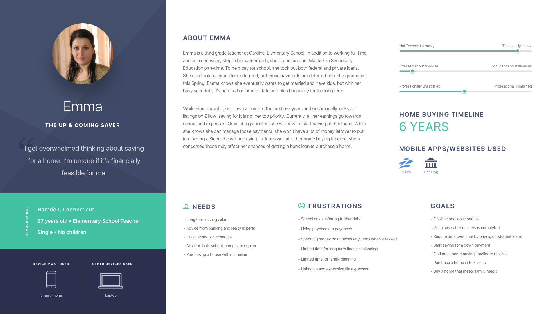
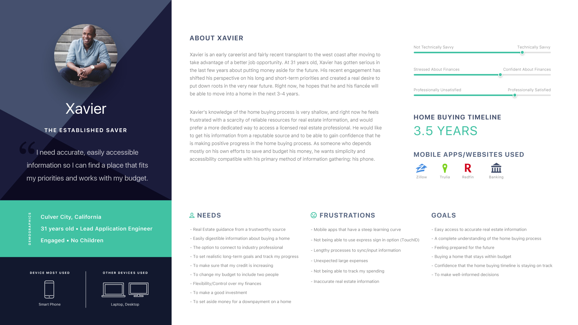
The key takeaways that resulted from the user research interviews we conducted assisted in defining our design strategy and crafting two primary user personas. The personas were based off the insights, patterns, and trends that we saw in our data and aligned with key features for the app: building a personalized savings plan and utilizing search and chat tools for homebuyer education. The needs, goals, and frustrations outlined in the primary personas set up the framework for our customer journey maps and allowed for an in-depth understanding of user behavior and motivations.
Customer Journey Maps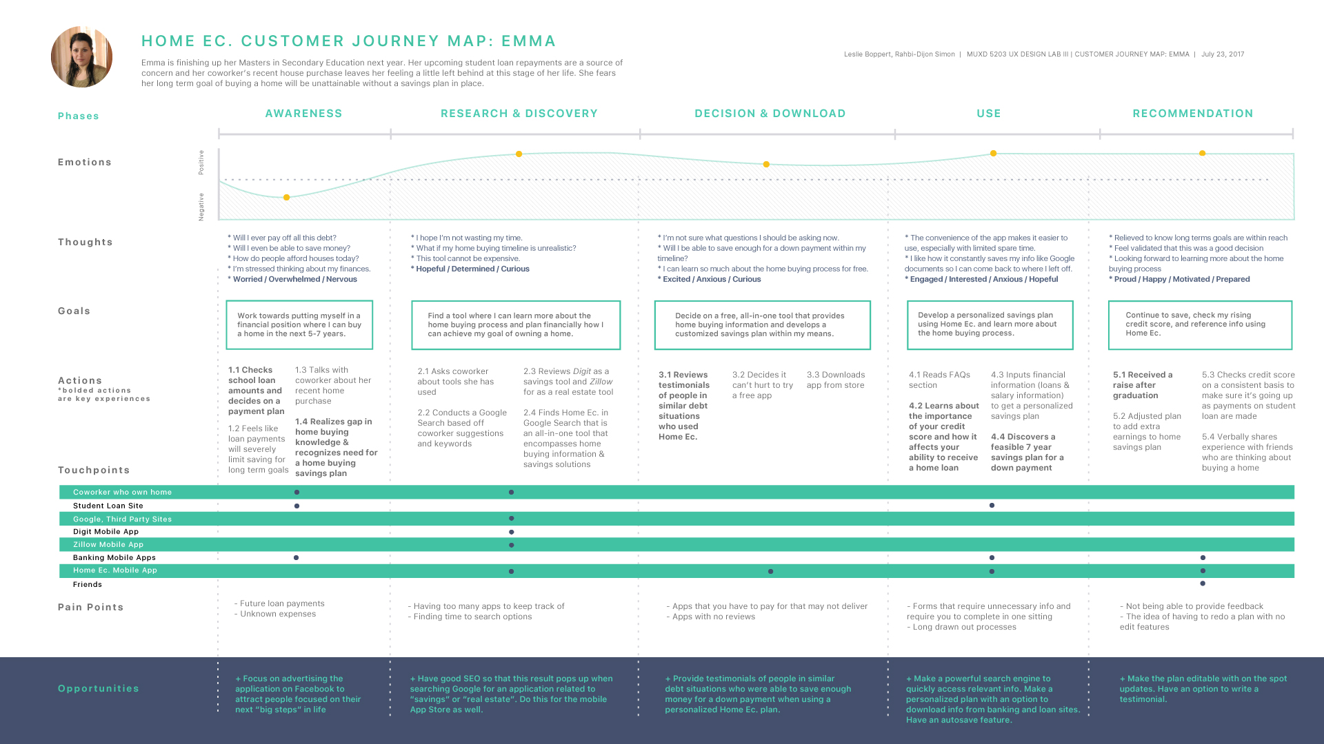
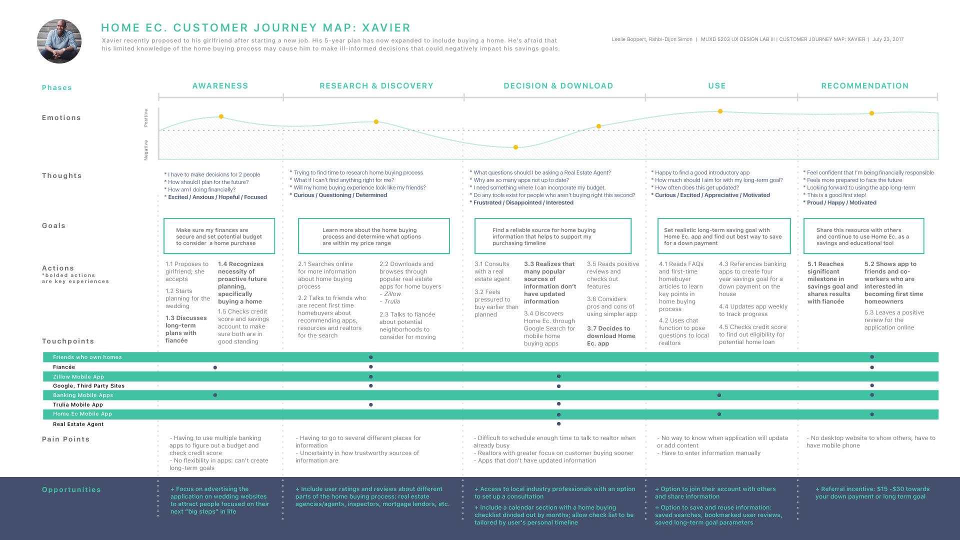
Customer journey maps helped us develop empathy with our users. We created a separate journey map for each of our personas that followed the motivations of users who would utilize different key features of the Home Ec. application. By mapping out the journey of our users, we were able to see what high frequency tasks our users would perform and to define the type of functionality they would need to successfully complete those tasks. In each, we mapped out customer activities, goals, touchpoints, emotions, and frustrations.
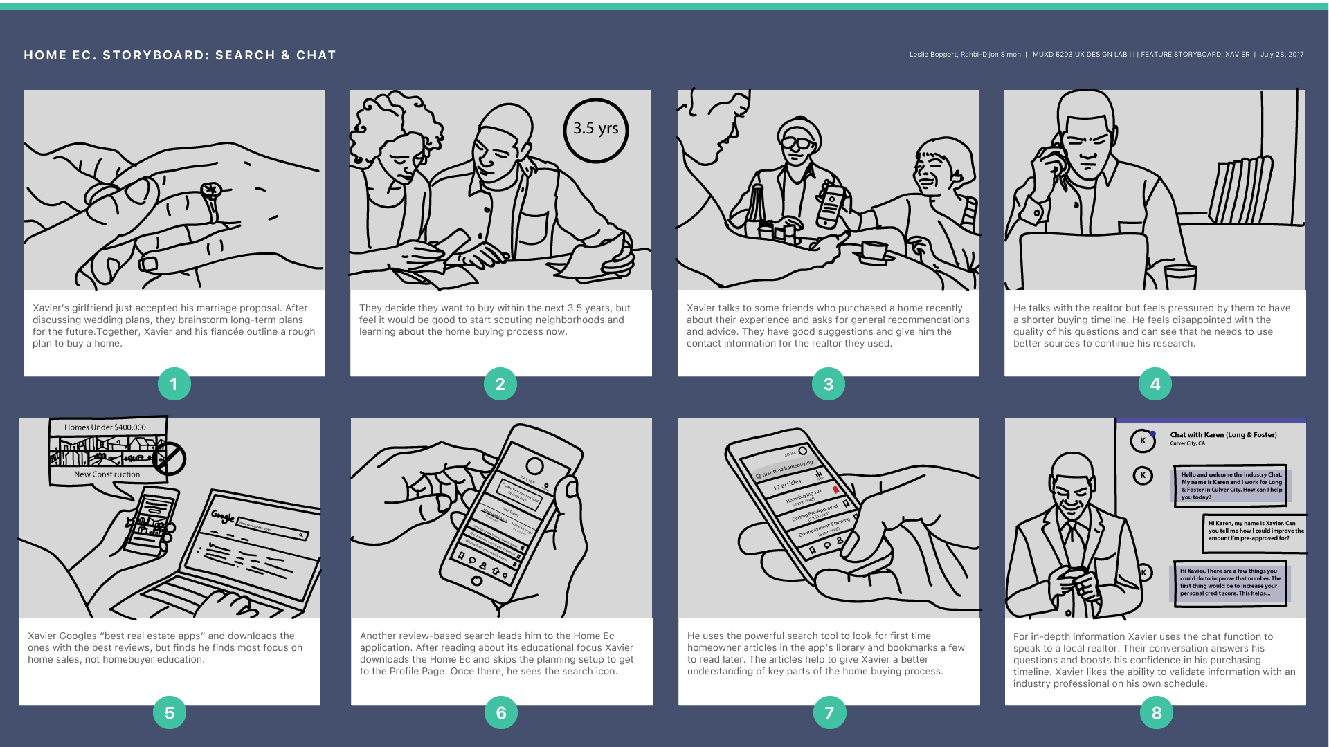
Storyboards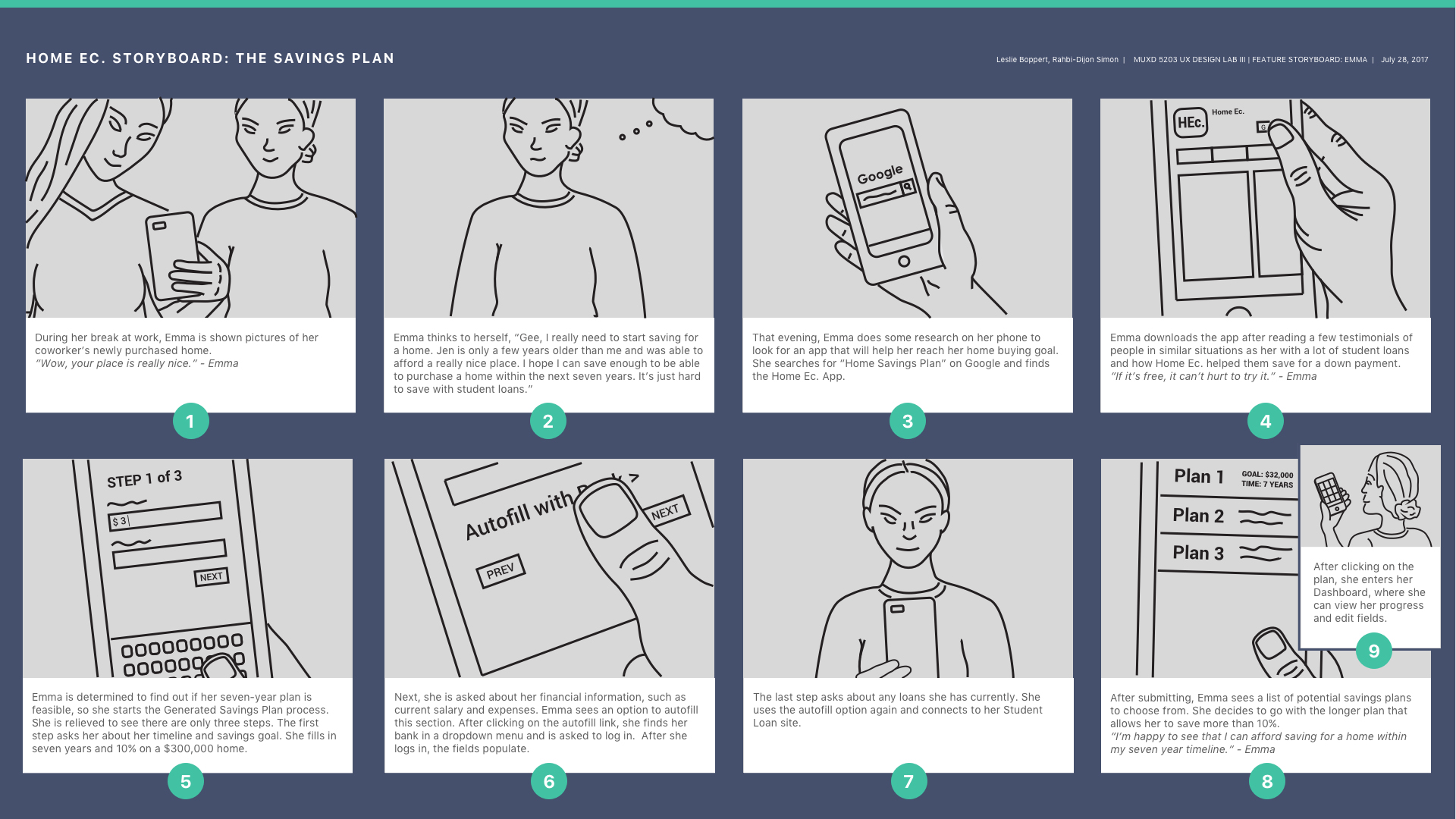
Wireflows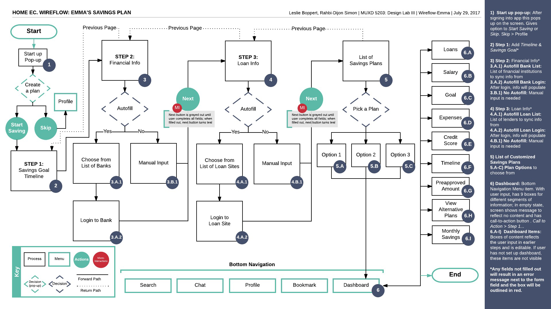
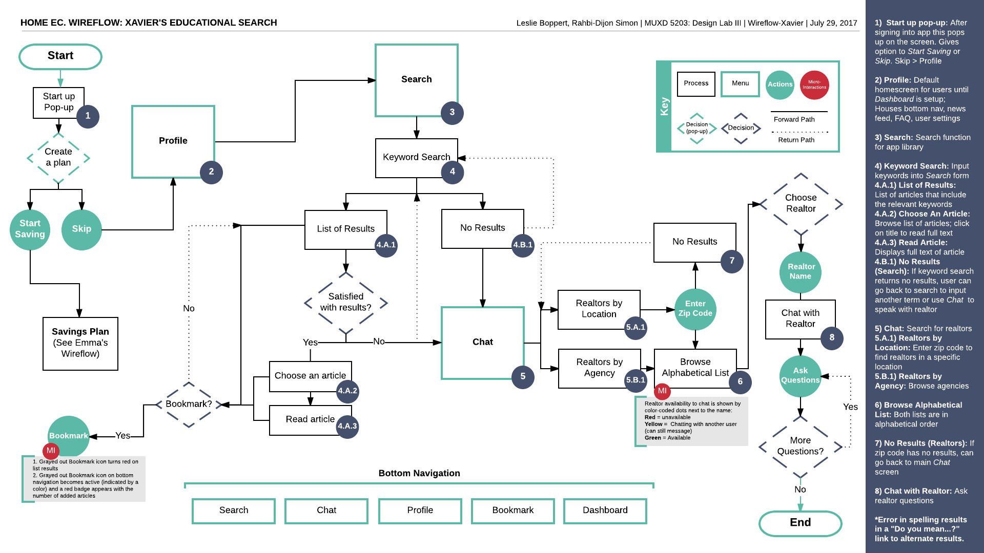
Mapping out wireflows during the design process created a visual blueprint that detailed the framework for how interactions are carried out within the application. Creating these artifacts helped to save time later in the design process by illustrating key features and decision points and acting as a design foundation for our future wireframes and interactive prototypes. Our wireflows were a collaborative tool in the design process and helped develop a shared understanding between team members and project stakeholders.
Each wireflow we created outlined priority interactions and microinteractions that we later visualized in wireframes. They served as a visual check to make sure the design of the Home Ec. application were feasible and aligned with the goals of the user.
Annotated Wireframes
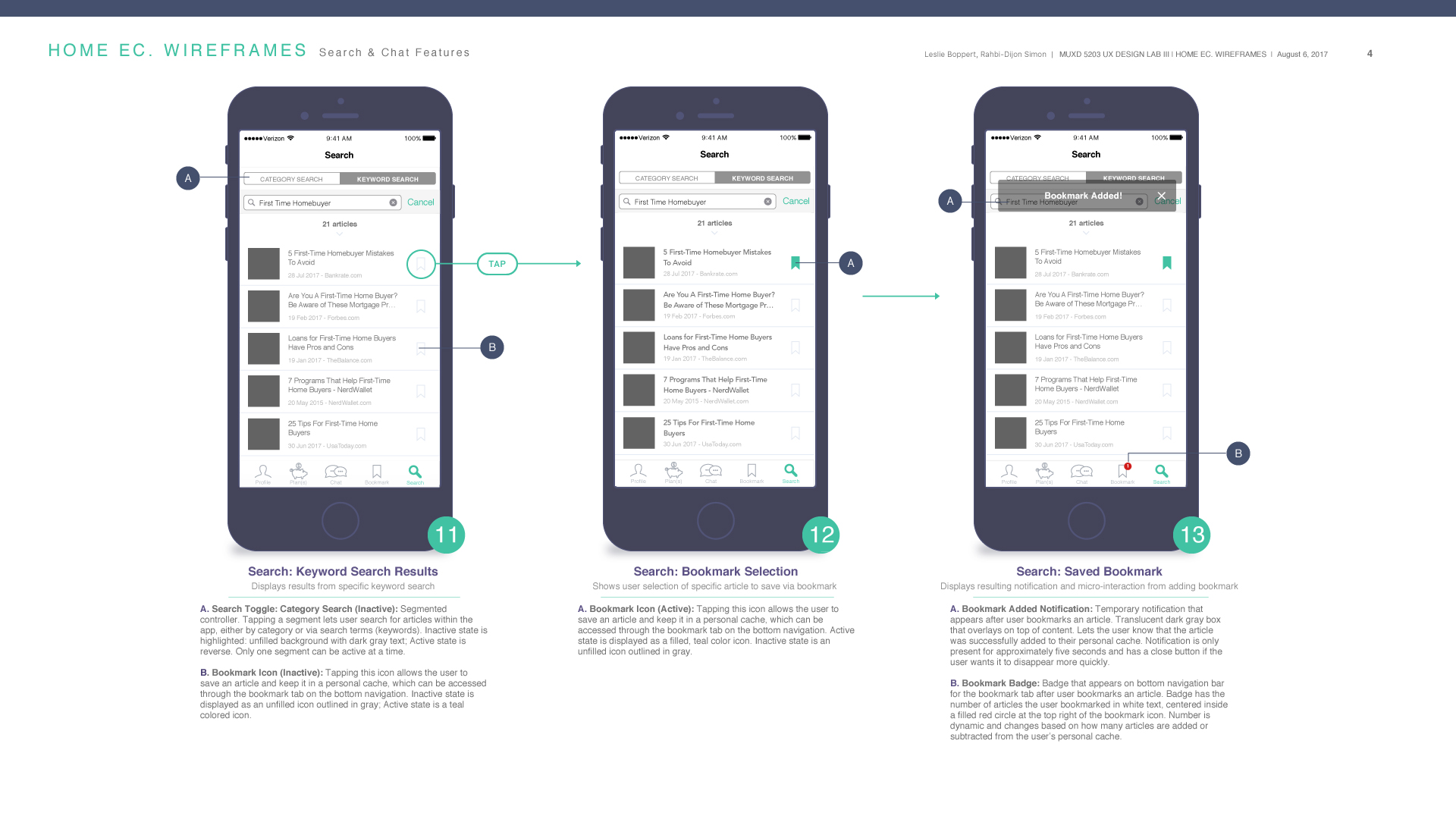
Based on user interviews, we decided to go with iOS as our operating system because the majority of our potential user base owns an iPhone. Using Apple’s Human Interface Guidelines as a reference, we created and annotated wireframes that helped us map out the application’s screens and determine the flow and interactions needed to build a solid application for users. It was a good stepping stone for our high fidelity prototype.
User Testing
Main Testing Objectives
After building the Home Ec. prototype and receiving feedback from our professor, we defined our main objectives for user testing:
- Identify which search methods are most intuitive to our users
- Determine if participants are able to find where previously accessed information is stored in the app
- Determine if the application’s icons and Information Architecture are universally understood
- Confirm if the application’s Information Architecture aligns with user’s mental models
- Observe and document any areas of frustration or inefficiency within the application’s form design or navigation
- Determine if the Home Ec. application is easy enough to use for both novice savers and potential home buyers
Testing
Each test took on average 30 minutes and was administered using Google Hangouts. Moderators used Quicktime to record the participant’s screen and audio while the CanvasFlip Prototype simultaneously recorded the participant’s screen and tracked mouse movements and clicks during the scenario/task section. Before recording, participants took a short survey using Survey Monkey. The link was either emailed or sent via the Google Hangouts Chat. After finishing the survey, participants were prompted to screenshare and the recorded session began with a verbal introduction. Then participants had 10 scenarios with tasks to complete and two qualitative questions to answer. After interacting with the mobile application, they were asked impression questions.
Note: Testing notes and recordings will not be provided in order to protect participants’ privacy.
Who We Tested
- Six participants
- Ages of 20-34
- Employed
- Majority in some type of committed relationship
Metrics: Defining Success and Completions
Task Score
- Score 3 – Completed the task with relative ease
- Score 2 – Completed task with slight difficulty
- Score 1 – Completed task with difficulty
- Score 0 – Abandoned the task
Severity of Issues
Determined by the % of participants who received a score of 0 or 1 on tasks.
- Critical: ≥ ½ of participants
- Moderate: ⅓ of participants
- Low: ≤ ⅙
Percentage of Success
Determined by the % of participants who received a score of 2 or 3 on tasks.
Task/Questions Sample
You decide to go with Plan 1. Find where to manually edit the Plan Details.
Key Takeaways from Testing
- Plan Dashboard page: The Options button was confused for the Edit button due to placement.
- Plan Dashboard page: The Individual Plan Details were clicked on outside of the Edit screen and thought to be directly editable.
- Plan Dashboard Page: The title of the selected User Dashboard screen does not match the title from the Preview Plan screen.
- Preview Plan page: The difference between Preview Plan page and the selected Plan Dashboard was not noticeable enough.
- Chat page: The Archive button was perceived as a secondary way to access old messages instead of a primary path.
Iterations
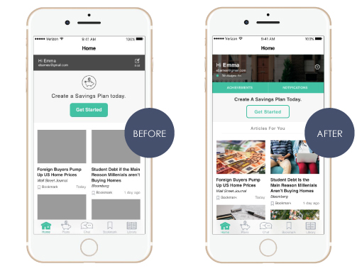
For our Before and After examples, screens displayed on the left show what users saw during testing. Screens displayed on the right show the changes we made to our application after testing. All our changes were based on participant feedback, which helped us create a better design for the application.
While no participants during user testing had any issues with the home screen, we decided to make some changes to deliver a better experience. On the Home screen above, we added Achievement and Notification buttons to highlight areas of interest participants had mentioned. We also included a Recently Earned Badge listing in the personalized header to keep users continuously interested in meeting their savings goals. To emphasize personalization, which participants greatly valued, we created a header before the article feed stating, “Articles For You”.
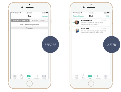
On the Chat screen above, participants felt they should be able to access old conversations with realtors by clicking on their name, similar to other messaging systems. Since our original design did not fit participants’ mental models, we decided that the Chat screen should list the user’s message history with the most recent message listed at the top. In order to search for new realtors, we included a “Realtor Search” link in the top left-hand corner of the header. By making this change, we hope that this will be a more intuitive messaging system for people to use.
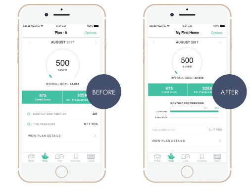
On the Plan Dashboard screen above, one participant was confused that the Plan name in the header did not match the selected Plan number. Therefore, we added a pop up after selecting a Plan that asks the user to name their Plan. If they proceed to do so, the name appears in the header (i.e. My First Home). If they choose to Skip it, “Plan – A” will show up as their first Plan title. Any unnamed Plan title thereafter will be in descending alphabetical order.
Another participant mentioned including more visuals depicting financials. With limited Dashboard space, we decided to showcase the most important information when viewing this screen. The visual we highlighted was a bar chart of the monthly amount saved compared to the monthly savings goal.
One last issue that arose was participants thought they could edit the plan details by clicking on the line items. We grayed out the line items to visually show they are not editable until selecting the Edit button under the Plan Details dive in or the Options action sheet.
Home Ec. Playbook